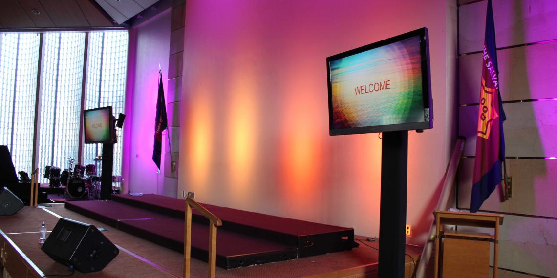
4 Slide Design Tips for Worship
Designing the slides that present your content during worship times is really important. They make or break the attention that your congregation will pay, and if they look tacky, it’ll be noticed. There are a whole host of needs and styles out there, and each church will be different in its approach. Here are a few generic tips for designing slides for worship.
1. Find a great font:
Consistency is key. Make sure that your fonts are consistent from slide to slide. It takes a lot of exceptional creativity to make different typefaces work, and more often than not, if it’s executed badly it’ll just end up as a big distraction. Also, make sure that font sizes are consistent — 40 point works well as a catch all for most people. Sans serif fonts work really well, as they’re easy to read and also easy on the eyes.
2. Make sure the lyrics flow well:
Some songs are easier than others in this regard, but you should make sure that your slides logically break up lyrics into phrases that make sense. Lyrics are written to flow, and putting line breaks in awkward places will lead people to switch off or struggle to pay attention to what the song says. Make sure your lines are structured in a way that mirrors the musicality and phrasing of the lyrics. It’s also good to restrict the number of lines per slide — 5 should be your maximum because any more than that will feel cluttered and busy.
3. Style and format your lyrics:
There’s a few schools of thought here. Many churches will remove as much punctuation as they can from songs, keeping only the commas, full stops or phrasing that directly inform the singer of how the song flows. Other churches try to emphasise the poetic devices employed by songwriters by using punctuation. This is a matter for you to determine with your pastor or officer, but nevertheless, all of your slides should be spell checked. It’s also good to make sure references to God are capitalised. Lyrics preset the best when centered vertically and horizontally, and it’s also a good idea to put a light outline around your text so it pops out against its background.
4. Look for suitable backgrounds:
This can vary as well. Depending on your context, you might just use solid colours, or busy patterns, moving motion graphics or still photos. Try and match the mood of the slide to the mood of the song and congregation. Just be sure to keep the focus on what needs to be seen, and work in subtlety. Jarring changes in colour or style really break attention, so make sure your slide flow progresses logically.
There’s a ton of free graphics available online. Our External Resources page lists a few of our favourites, but there are plenty of free and subscription based services out there. When designing your slides, sticking to these guidelines will ensure that you have engaging and easy to read content, contributing to a great worship experience.

Article written by: Kris Singh
Kris joined Creative Ministries team in late 2014, bringing with him a Degree in Media Studies and Sociology, as well as experience as a worship leader, musician, writer and producer. He is passionate about advancing the cause of creativity in The Salvation Army and seeing people discover their God-given creative potential.